
Exploring NBA Data to Win My Fantasy League
When you like data, and you like basketball, why not put 'em together?
Introduction
I have always been a fan of the NBA, particularly the Utah Jazz. This year, I am taking that to a new level: I joined a fantasy basketball league (or three). If you aren’t familiar, fantasy basketball is a competition where you choose a few players across the league, no matter what team they are on, and then see how your team stacks up against other people’s teams. This has me tracking certain players and stats like never before. Being a data guy, I decided to use my skills to gain the upper hand and explore some NBA stats.
About the Data
The data for this analysis comes from NBA box score data found at https://www.nba.com/stats/players/boxscores. It contains a row for every game played for every player. For example, if a certain player has played in 10 games this NBA season, the data will contain 10 rows for that particular player. The columns included are basic stats like points, rebounds, assists, turnovers, and more. Formatting data like this allows me to easily group data into stat totals and averages per game, which allows for more insights. After I had scraped this data, I used Pandas to calculate the number of fantasy points scored in a game and added it as a new variable.
Analysis
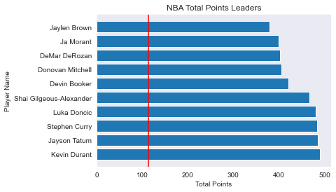
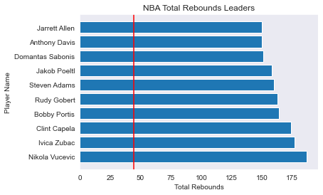
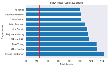
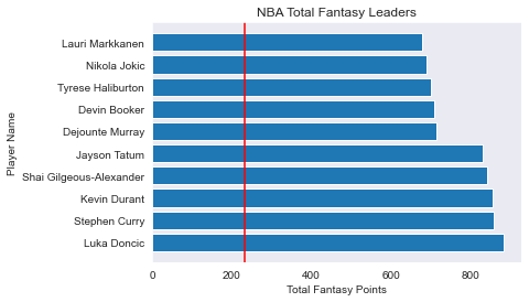
Totals Leaders
The first thing I look at is totals leaders. Who has the most rebounds this year? Who has scored the most? I made a few horizontal bar charts to show the leaders. This allows the viewer to clearly see the player’s names along the y-axis. Here are charts that show the 10 players with the highest total points, rebounds, assists, and fantasy points.
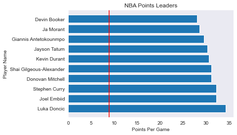
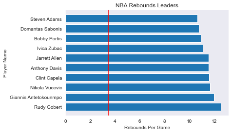
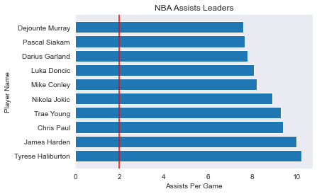
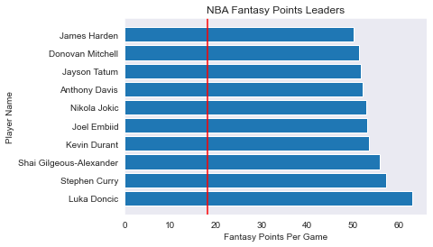
Per Game Leaders
The next few charts are similar to the last. We are still looking at the leaders in the main stat categories, but this time it is weighted per game. Doing this can give some insight into who is doing well on a consistent basis.
Efficiency
In my fantasy leagues, 2 points are awarded for an assist and 2 points are deducted for a turnover. Therefore, I want to see who is getting the most assists while limiting their turnovers. A scatterplot is a good way to show this. Since we want to see how specific players are doing, a plotly chart is a good way to go.
A common way people choose which players to add in fantasy basketball is to look at who is playing the most minutes. After all, you can’t score much or accumulate good stats if you aren’t playing very much! A great way to choose a player is to see who is playing the most minutes while also earning fantasy points. A plotly scatterplot is again a great way to view this.
Conclusion
In conclusion, this is a great way to see who is doing well in the NBA. Next time, I will make some conclusions and bring it all together to answer my big question: Who should I add in fantasy? For now I ask, what would you add? What kinds of charts would you look at to explore NBA stats? Let me know below!